Get Your ELT Aligned With This Vibe Coded Partner Pipeline Tool
Expert advice from Casey Padgett (Partner Director, Charted) and Justin Zimmerman (Founder, Partnerplaybooks).
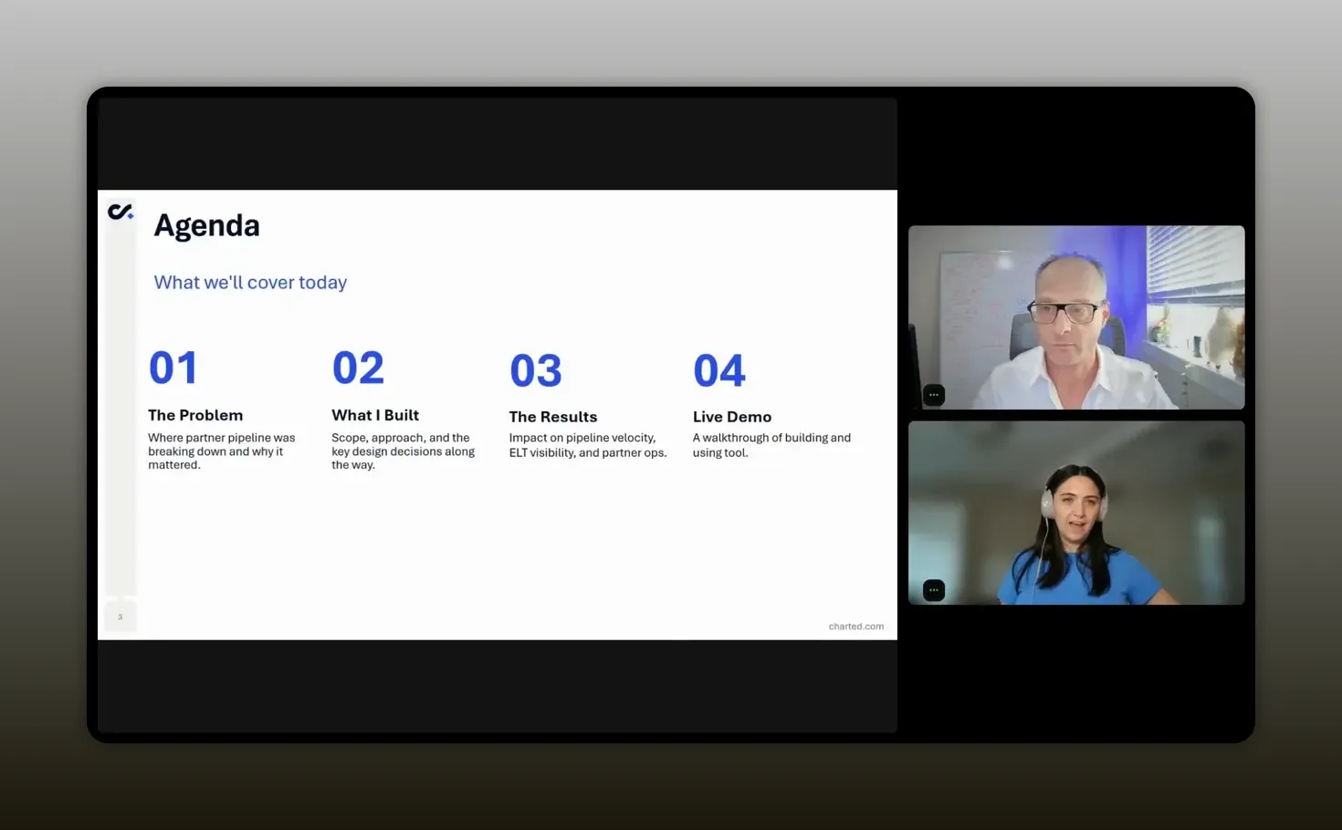
Table of Contents
- Snapshot
- Why this dashboard needed to exist
- The core metrics Casey tracked
- What the tool needed to do
- Why AI was the right build partner
- Start with business logic, not design
- How the first version was prompted
- What the live dashboard actually showed
- How the dashboard changed the workday
- Lessons for building your own version
- Recommended tools
- FAQs
- Conclusion
Snapshot
You are probably already sitting on the data you need to run partnerships better. The problem is translation, not access. Your CRM can show you what is there, but it usually does not tell you whether you are actually on pace, how much coverage you still need, what deals are likely to land, or where your next move should be. That gap matters more than ever when leadership wants fast answers, quarterly pressure is real, and partner teams are expected to operate with the same rigor as sales.
Casey Padgett’s approach shows what becomes possible when you pair deep business knowledge with AI. Instead of waiting on BI resources, exporting rows into spreadsheets, or living with stale snapshots, you can create a lightweight operating tool that reflects your own logic in real time. That means less guesswork, less manual math, and more confidence when the pressure shows up.
If you want to solve slow reporting, manual forecasting, and pipeline blind spots, keep reading to see how Casey Padgett and Justin Zimmerman can help you do it.
“Know your business deeply first. AI gets much more useful once you can clearly explain the logic behind your work.” -Casey Padgett
Why this dashboard needed to exist
If you work in partnerships, you know the feeling. You own a number. You have targets to hit. You have sourced revenue to drive, influenced revenue to support, and a constant stream of questions coming from leadership. But your systems rarely answer the question you actually care about.
Most CRMs are built to record reality, not coach action. They can tell you what opportunities exist. They can tell you which stage something sits in. They can show closed won data and maybe a forecast rollup. But that still leaves a painful gap.
You still need to ask yourself:
- Am I really on track?
- Do I have enough pipeline coverage to hit quota?
- What should I do next if I am behind?
- Which deals are likely to close from a partner perspective?
That was the exact problem Casey was trying to solve at Charted. As a senior alliance manager, she was managing multiple relationships and carrying a quarterly number. Salesforce held the data, but it did not turn that data into a decision-making tool.
So she built one.
“Your CRM shows what exists. The real unlock is building something that tells you what to do about it.” -Casey Padgett
What makes this especially relevant right now is that many partner teams still do not have a dedicated PRM or custom BI environment that works exactly the way they need. You might be using Salesforce, HubSpot, Pipedrive, or another system of record, but if you are still exporting data and stitching together spreadsheets, you are paying a time tax every week.
That time tax adds up in hidden ways:
- Leadership gets slower answers.
- Your forecasting confidence drops.
- You spend less time enabling partners and sourcing opportunities.
- Your reporting turns reactive instead of strategic.
Casey’s solution was not to ask for a giant analytics project. It was to use AI in a practical, hands-on way that let her build a dashboard around her own workflow.
The core metrics Casey tracked
To understand the dashboard, you first need to understand the operating model behind it.
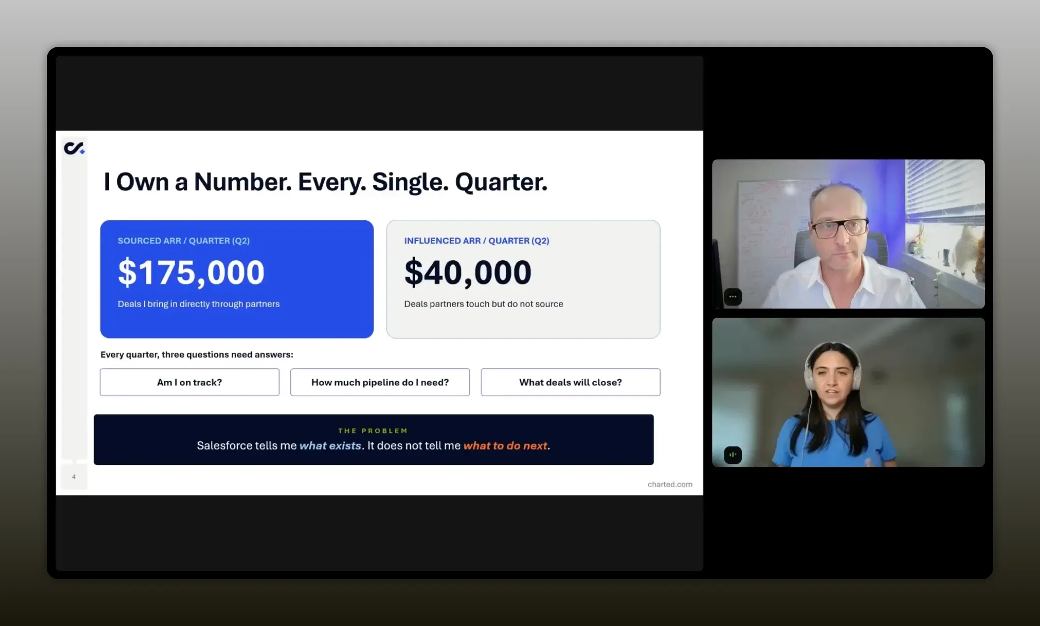
Casey broke her quota into two buckets:
- Sourced ARR, which covered deals a partner directly brought to the table
- Influenced ARR, which covered deals where a partner did not originate the opportunity but played a meaningful role in helping it close
That influenced bucket matters a lot in partnerships. A partner may shape the buying process, help with stakeholder alignment, support contract navigation, or strengthen the internal champion. Those deals may not show up as sourced, but they still carry real revenue impact.
From there, Casey needed a way to answer a few recurring forecast questions:
- How much pipeline coverage is required?
- How does existing pipeline compare to target?
- What is the expected ARR based on historical close rates?
- What is the gap between expected outcomes and target?
- How many deals does that gap represent based on average deal size?
Those questions are not hard conceptually. But they get tedious quickly when you are doing the math by hand, especially once you introduce probabilities, multiple pipeline buckets, current quarter closed business, and local adjustments for deals you personally believe will close.
In Casey’s case, she had a few important business assumptions ready before any build started:
- A target pipeline ratio of 3x
- An average partner close rate of 40 percent
- An average sales price around $13,500
Those assumptions became the engine of the dashboard. AI did not invent them. Casey brought them.
That is a crucial distinction. The quality of the output came from clarity around the business rules.
“I look at my quota in two buckets—sourced ARR and influenced ARR—and the dashboard is the difference between knowing what exists in Salesforce and knowing what to do about the gaps.” -Casey Padgett
What the tool needed to do
Once the problem was clear, the feature list became pretty straightforward.
Casey wanted a dashboard that could do five main jobs well.
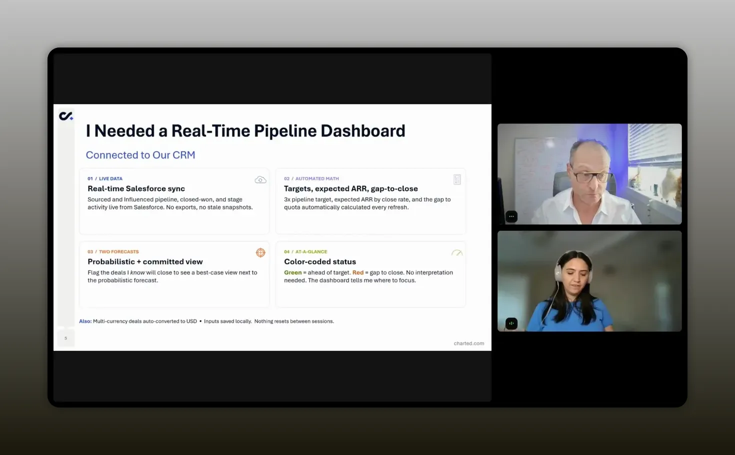
1. Pull live CRM data
She needed a real-time connection to Salesforce so she could see source pipeline, influenced pipeline, closed won numbers, stage activity, and current status without relying on exports.
The difference between a live sync and a spreadsheet snapshot is bigger than it sounds. A spreadsheet becomes stale almost immediately. A synced dashboard becomes something you can actually check every morning with confidence.
2. Automate the forecasting math
This was the part she especially wanted out of Excel. Coverage math is simple enough on paper, but once you factor in close rates, average deal size, and weighted expected outcomes, a quick check turns into a mini model.
She wanted the dashboard to update those formulas automatically whenever the inputs changed.
3. Support two forecasting views
Casey did not want just one forecast. She wanted:
- A probabilistic view based on historical performance
- A committed view based on her own judgment about specific deals
This is where partnership teams often have unique signal. Sales may own the opportunity forecast, but partner managers usually hear things that never make it into a standard forecast call. You may hear confidence from the partner, concern about timeline, or signs that a deal is about to accelerate.
Being able to reflect that insight without changing the official AE forecast is incredibly useful.
4. Use clear visual status indicators
Casey wanted the dashboard to make sense at a glance. That meant color coding. Green if things looked healthy. Red if something needed attention. A dashboard that requires interpretation every time is not much of an operational advantage.
5. Handle real-world details
The system also needed to account for multiple currencies and convert them into USD, save local inputs, refresh quickly, and preserve work between sessions.
In other words, this was not a toy. It needed to be useful on an actual workday.
“What made the tool valuable was not just the data pull. It was the math, the context, and the fast visual signal.” -Casey Padgett
Why AI was the right build partner
Casey framed this as building with AI through conversation rather than traditional coding. The phrase often used for this is vibe coding, but the substance matters more than the label. She described it as using natural language to tell an AI assistant what you want and then iterating until the result matches your needs.
That framing matters because it removes a lot of fear. You do not need to start from “I am a developer.” You need to start from “I understand the workflow I am trying to improve.”
That is a powerful shift for partnership professionals.
In many organizations, AI adoption has moved faster in sales, marketing, and product than in partnerships. Partner teams often know there is opportunity there, but they are not always sure where to start. Casey’s example gives you a practical answer.
Start where the pain is obvious. Start where manual effort is constant. Start where logic is clear enough to explain.
If you are exploring where AI fits inside partner operations more broadly, this guide on how AI will reshape partnerships is a useful next read because it covers the operational foundations that make these experiments work.
What Casey built also reinforces a broader lesson. AI is strongest when it is paired with structured process knowledge. It can accelerate creation, but it still needs someone who knows:
- What success looks like
- Which fields matter
- How the formulas should work
- What should happen when the output is wrong
Start with business logic, not design
One of Casey’s smartest moves was not trying to build the perfect version first.
She started simple.
Before asking AI to connect to Salesforce or add polished visual design, she focused on getting the logic out of her head and onto the page. That meant defining the formulas, the categories, and the outputs that mattered.
This sequencing is worth copying.
When people struggle with AI-assisted building, it is often because they ask for too much too early. They want integrations, styling, edge cases, and final polish in one shot. That usually creates confusion and messy output.
Casey’s process was more disciplined:
- Define the problem clearly.
- List the business assumptions.
- Specify the formulas.
- Build a rough first version.
- Iterate from there.
That mirrors the same advice many strong AI operators use in other business contexts. Break the work into stages. Get one layer right before moving to the next.
This is also why her accounting background actually helped, even though she joked about not wanting to live in spreadsheets. If you understand how numbers roll up, how targets relate to pipeline, and what assumptions are doing the work under the hood, you can guide AI much more effectively.
How the first version was prompted
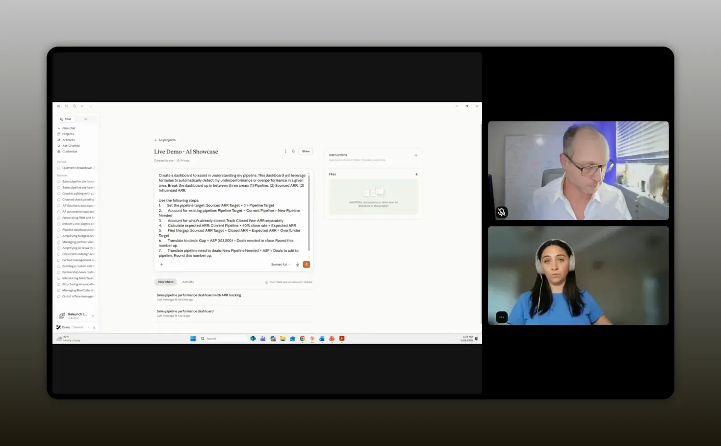
Casey’s initial prompt structure was practical and direct. She did not ask for something vague like “build me a great partner dashboard.” She explained the purpose, defined the key areas, and told Claude exactly how the calculations should work.
At a high level, her first request included:
- A dashboard for understanding pipeline
- Automatic detection of overperformance or underperformance
- Breakdowns for pipeline, sourced ARR, and influenced ARR
- Specific steps for calculating targets, existing pipeline, expected ARR, and remaining gaps
- Conversion of ARR gaps into number of deals needed
She also shared a practical prompt tip that is easy to miss but genuinely useful. If your output needs a whole number of deals, ask the system to round up. A result of 3.8 deals is not actionable. Four deals is.
“Be specific. AI works much better when you give it exact steps and clear expectations for the output.” -Casey Padgett
This idea of specificity came up repeatedly. Casey compared instructing AI to guiding a very literal beginner. If you are vague, you will get vague results. If you are precise, you dramatically increase your odds of getting something useful.
That means naming:
- The sections you want
- The formulas you need
- The field names involved
- The difference between source and influence logic
- The exact behavior of color states and forecast views
It also means correcting errors instead of treating them as failures. When Casey first built the dashboard, the color coding was wrong. The fix was not to give up. It was to say, in effect, “This condition should be green, not red. Update the logic.”
That willingness to correct the system is one of the biggest differences between frustrating AI use and productive AI use.
What the live dashboard actually showed
Once the dashboard matured, it became something much more useful than a static report.
Casey’s live version was connected to Salesforce and organized around the metrics she cared about most. Because sourced ARR carried more weight in her quota, that section appeared first. The dashboard showed:
- Current sourced pipeline
- Already closed sourced ARR
- Expected ARR based on current pipeline and historical assumptions
- Pipeline gaps
- Color-coded health indicators
- A field for manually adding a committed deal
That manual committed-deal input is a subtle but important feature. If Casey had high confidence that a specific deal was about to land, she could enter it into the dashboard and instantly compare the committed view to the probabilistic one.
That gives you a way to model judgment without distorting your official sales forecast.
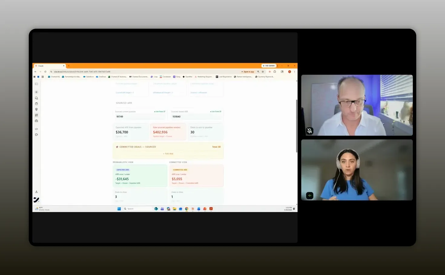
“The best part was being able to check the dashboard in real time and immediately see where I stood.” -Casey Padgett
The influenced ARR section mirrored the same structure, which made the dashboard easier to use. Once you understand the logic in one section, the rest follows naturally.
And when the dashboard needed a refresh, Casey had a simple workflow. She would prompt Claude to resync and pull the latest information. That became part of her daily routine.
This is where the tool crossed from “interesting AI experiment” into “operating system for the quarter.”
It was not just a report. It was a way to answer, every morning, whether anything changed overnight and what that meant for the plan.
If you are building partner reporting around multiple systems and trying to make better use of operational data, you may also find value in this article on ecosystem data, dashboards, and AI agents. The same principle shows up there too: good outputs come from clean logic and well-structured inputs.
How the dashboard changed the workday
The value of this kind of build is not just efficiency. It is emotional clarity.
Justin asked Casey a great closing question about what changed beyond the numbers. Her answer got to the heart of why tools like this matter. The dashboard reduced frustration. It removed the scramble that comes when leaders ask for an update late in the day and you have to piece together the story manually.
It also solved another common problem in partnerships: invisible effort.
Partner work often spans sourcing, influence, enablement, relationship management, deal support, and long-cycle business development. Without clear visibility, it can feel like a lot of the work disappears into the background. That is especially true in a quarter where pipeline might look light even if your actual execution is solid.
Casey said the dashboard helped make progress visible. Even if there was a pipeline deficit in one part of the model, she could still see how the quarter was developing and where performance was stronger than it first appeared.
That kind of visibility does a few important things:
- It gives you faster answers for leadership.
- It helps you trust your own plan.
- It reduces the anxiety that comes from unclear status.
- It keeps your time focused on work that drives revenue.
There is a broader lesson here for any partnership team trying to prove and improve impact. Visibility is not just about reporting up. It is also about being able to see your own contribution clearly enough to manage it well.
Lessons for building your own version
Casey wrapped her session with several practical takeaways that are worth turning into a repeatable build checklist.
Know your business deeply
This came first for a reason. AI can help build the artifact, but it cannot replace your understanding of the workflow. You need to know the formulas, the field names, the definitions, the logic, and the purpose behind the dashboard.
If you cannot explain how source versus influence is tracked in your CRM, or what a healthy pipeline ratio should be, you are not ready to ask AI to build a useful model.
Start simple, then iterate
The first version should focus on the essentials. Get the formulas working. Get the layout usable. Then add integrations, visual refinement, and edge case logic later.
This is one of the strongest patterns in practical AI adoption. Crawl first. Then walk. Then run.
Be highly specific
Specificity improves output quality. Give the system the exact steps, categories, and expected behaviors. If you need a certain view, say so. If you need a metric weighted a certain way, say so. If the dashboard should display health with color states, define the conditions.
Correct the system when it gets things wrong
Mistakes are part of the process. If a formula is off or a color state misfires, point it out clearly and explain the right condition. Casey treated AI less like an oracle and more like a collaborator that needed direction.
Look at your biggest time drain
Not everyone needs a pipeline dashboard. For you, the best use case may be partner event planning, account research, data cleanup, enablement material creation, or partner communication workflows.
The right place to start is wherever manual effort is highest and the logic is clear enough to articulate.
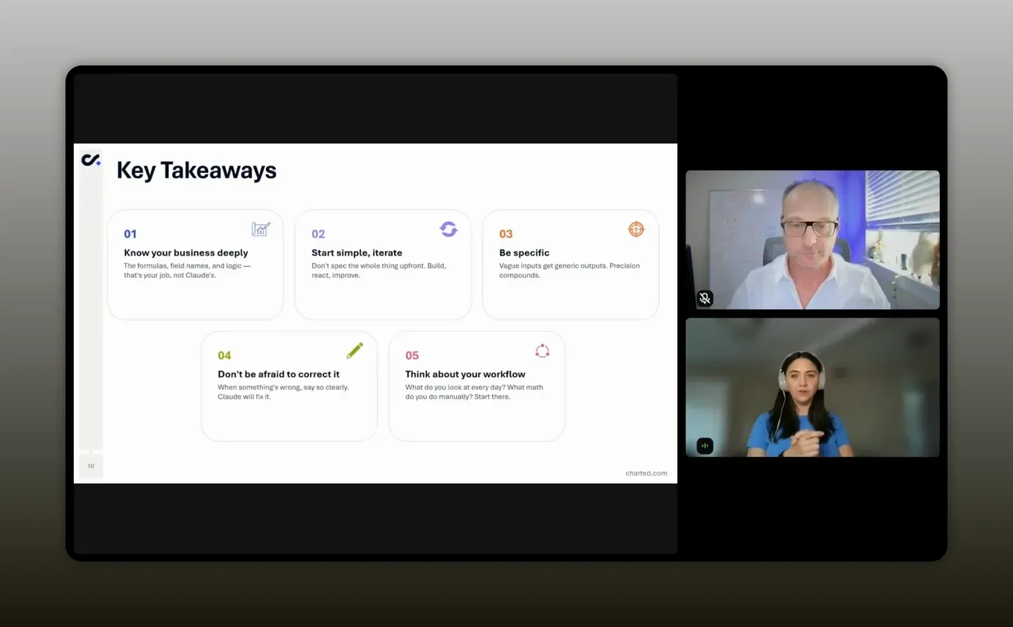
“Start with the biggest time suck in your workflow and build there first. That is where AI becomes easiest to justify.” -Casey Padgett
If your work involves recurring partner research, prompt design, or AI-assisted workflow creation, the practical examples in Claude for beginners for partnerships can help you build from the same mindset Casey used here.
Recommended tools
You do not need a massive stack to recreate the spirit of this workflow. Casey’s setup points to a lean combination of tools that can take you surprisingly far.
Claude
Claude was the AI build assistant Casey used to create and iterate on the dashboard. In her environment, it was available as an enterprise deployment and integrated with Salesforce and internal documentation.
Salesforce
Salesforce served as the system of record. The dashboard became useful because it connected directly to live CRM data instead of relying on exports.
OneDrive
For internal publishing and broader organizational visibility, Casey mentioned using OneDrive so others could access the same artifact. That did require some support to wire up properly.
Internal documentation systems
Her team also connected Claude to internal documentation stored in GitHub. That is a helpful reminder that AI becomes more powerful when it can access the context your company already maintains.
If you are evaluating where to focus operationally, a simple starter stack for this kind of work usually includes:
- An AI assistant that can handle structured prompting well
- A CRM with clearly defined fields and ownership
- A place to publish or share artifacts internally
- Clean documentation for business logic and definitions
For general context on CRM-centered forecasting and pipeline discipline, Salesforce’s own sales pipeline guidance and HubSpot’s forecasting resources are useful references, especially if you are adapting Casey’s framework to a different system.
FAQs
Do you need to know how to code to build a dashboard like this?
No. Casey’s whole point was that you can build a highly useful operational dashboard through natural language interaction with AI. What you do need is a strong understanding of your business logic, your metrics, and your workflow.
What made the dashboard better than a normal CRM report?
A standard CRM report shows what exists. Casey’s dashboard added forecasting math, gap analysis, committed versus probabilistic views, and visual status indicators. That turned raw data into an action tool.
Why was it important to have both sourced and influenced ARR?
Because partner impact often comes through more than direct sourcing. Influenced revenue captures deals where partners shape the outcome even if they did not originate the opportunity. For many alliance teams, both are essential to understanding true performance.
What is the difference between a probabilistic forecast and a committed forecast?
A probabilistic forecast uses historical patterns such as close rate to estimate likely outcomes. A committed forecast reflects your own confidence in specific deals that you believe are more likely to close than the baseline model suggests.
What should you define before asking AI to build something like this?
You should define your metrics, field names, target logic, close rates, average deal size, category definitions, and the exact outputs you want. The clearer you are up front, the better the result will be.
Can a dashboard like this be shared internally?
Yes. Casey said her team was able to publish the dashboard internally so leadership and peers could see the same artifact. That did require some additional technical support to connect it into their internal sharing workflow.
What is the best first use case for AI in partnerships?
The best first use case is usually the one causing the most repetitive manual work. For Casey, that was pipeline management. For you, it might be forecasting, partner research, event planning, enablement, or reporting.
Conclusion
Casey’s dashboard is a strong example of what practical AI adoption looks like in partnerships. It is not flashy for the sake of being flashy. It solves a real operating problem. It gives faster answers. It reduces manual work. It makes partner impact easier to see. And it proves that you do not need to wait for a full product team or analytics team before improving how you run your book of business.
The bigger lesson is simple. AI is most useful when you bring structure to it. If you understand your numbers, your definitions, and your process, you can build tools that feel custom without traditional coding. That creates more time for the work that actually moves partnerships forward: selling, enabling, coordinating, and growing revenue through the ecosystem.
That is the real opportunity here. Not replacing judgment. Amplifying it.